The Global Diet Puzzle: What 60 Years of Food Patterns Tell Us About Longevity
Introduction
In today’s globalized world, the link between diet and health has never been more important. As populations grow, urbanize, and adapt to different food systems, the world faces a rising challenge: balancing dietary needs with sustainable health outcomes. Poor nutrition remains a leading contributor to chronic diseases, obesity, and shorter life spans. As access to varied and nutritious foods becomes more uneven across regions, understanding the nutritional gaps that influence health and life expectancy is crucial. In this study, we will explore the complex interactions between dietary patterns and longevity, uncovering the role of food diversity, macronutrient intake, and cultural dietary habits in shaping global health trends.

Description: This interactive dashboard reveals the evolution of global dietary patterns from 1961 to 2021. At its heart is a dynamic world map that responds to a time slider, allowing readers to journey through decades of dietary change. Below, a synchronized bar chart breaks down each country's dietary composition into key food groups. As you explore different regions on the map, the bar chart instantly updates to show the precise nutritional makeup of that country's diet. This dual visualization allows for both geographical and compositional analysis at a glance.
Why This Matters: Understanding how diets have evolved across different regions offers crucial insights into global health disparities and cultural transitions. This visualization serves as a powerful tool for identifying both concerning trends and success stories in global nutrition. By tracking the shift in dietary compositions over time, we can observe how factors like globalization, economic development, and cultural exchange have reshaped what ends up on people's plates. These patterns don't just tell us about food preferences – they reveal stories about urbanization, trade policies, and public health outcomes. For policymakers and health professionals, this information is invaluable in addressing nutritional challenges and developing targeted interventions that could improve life expectancy and quality of life across different populations.
The Current Landscape of Global Life Expectancy
Now, what is life expectancy, and what are the current trends? Life expectancy at birth serves as an indicator of a population's overall mortality rate. It represents the average number of years a person is expected to live from birth to death. Research shows that longevity is influenced by three primary factors: genetics, gender, and lifestyle, which includes elements like hygiene, diet, exercise, cultural habits, personal choices (such as smoking and occupation), healthcare access, and even crime rates. Given the variations in these factors across different countries, it's not surprising that life expectancy differs around the world.
As of 2023, the United Nations reported that global life expectancy stood at 70.8 years for men and 76.0 years for women, with an average of 73.4 years. Life expectancy differs greatly by region and country, ranging from a low of 57.7 years in Western Africa to a high of 82.7 years in Western Europe.
On the whole, life expectancy has been increasing. From 2000 to 2016, the global average life expectancy rose by 5.5 years, with parts of Africa seeing an increase of 10.3 years. This improvement can be attributed mainly to better child survival rates and expanded access to antiretroviral treatment for HIV/AIDS. Globally, the number of births now exceeds the number of deaths, contributing to rapid population growth over the past two centuries.
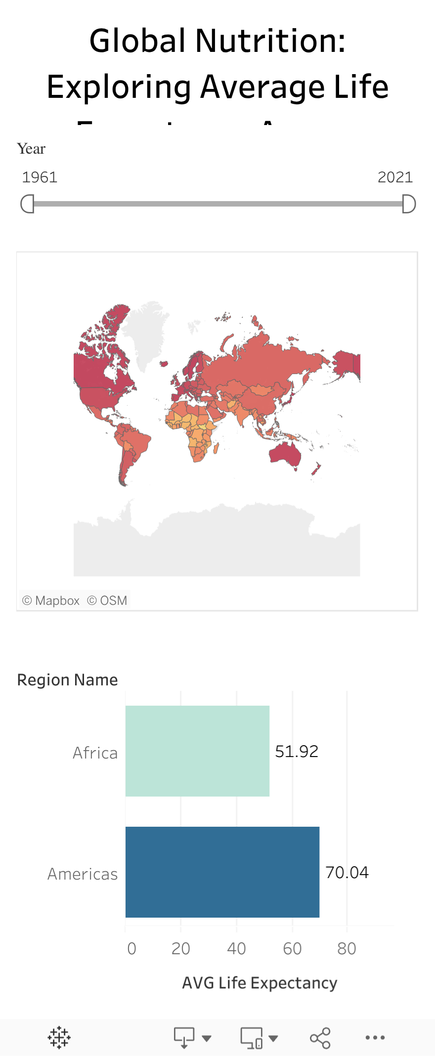
Description: This paired visualization displays global life expectancy trends through two complementary views. The choropleth map on the left provides a geographic snapshot of life expectancy across countries, using color intensity to highlight regional variations. On the right, an interactive bar chart tracks average life expectancies across different regions over time. The synchronized year slider enables viewers to explore how life spans have evolved, revealing both gradual improvements and dramatic shifts in population health. Together, these visualizations allow readers to simultaneously grasp both the current global state of longevity and its historical trajectory.
Why This Matters: Life expectancy serves as a powerful indicator of a population's overall health, social progress, and access to resources. Through this visualization, we can identify not just where people live longer, but also how quickly different regions are catching up or falling behind. These patterns often reflect broader societal factors: healthcare accessibility, economic development, political stability, and public health initiatives. By comparing regional trends, we can spot success stories where life expectancy has rapidly improved, offering valuable lessons for public health policy. Similarly, areas showing slower progress or declining trends may signal underlying challenges that require urgent attention. This data is crucial for understanding global health inequities and developing targeted interventions to bridge the longevity gap between regions.
The Role of Diet in Health and Longevity
Diet plays a central role in determining life expectancy. In this section, we will examine the critical role of macronutrients—such as fats, proteins, and carbohydrates—as well as micronutrients in promoting health and preventing diseases. We will explore how imbalances in diet, such as the overconsumption of processed foods or a lack of essential vitamins and minerals, contribute to shortened life spans and the rise of chronic diseases like diabetes, heart disease, and cancer. Drawing on extensive nutritional data, this section will establish a link between healthy eating patterns and longevity, highlighting the importance of food quality over quantity in ensuring longer, healthier lives.
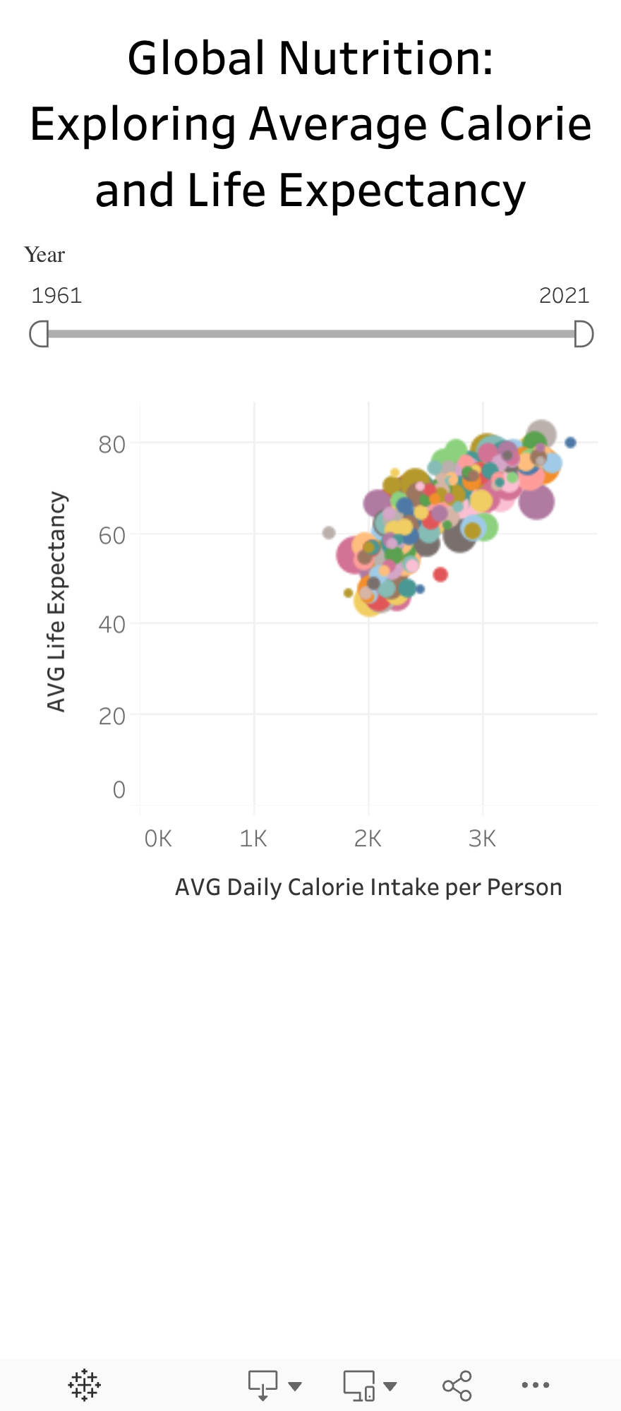
Description: This interactive visualization uncovers the intricate connection between a nation's food availability and its population's longevity. Each country appears as a point on the chart, creating a constellation of global health patterns. As viewers move the year slider, they can witness the dynamic evolution of this relationship over time. The clear clustering of points reveals compelling patterns about how access to adequate nutrition correlates with longer lives, while outliers tell stories of countries that defy typical trends. The animation through time creates a powerful narrative of global progress in both food security and life expectancy.
Why This Matters: Understanding the relationship between food availability and longevity provides crucial insights into global health inequities. This visualization demonstrates that the path to longer, healthier lives is deeply intertwined with a population's access to sufficient nutrition. However, the scattered distribution of countries also reveals that this relationship isn't straightforward – some nations achieve remarkable health outcomes despite limited resources, while others lag despite abundance. These patterns help policymakers and health professionals identify successful models for improving public health through better nutrition. More importantly, watching how countries move through time helps us understand which policies and interventions have been most effective at extending lives through improved food security. This knowledge is essential for developing targeted strategies to reduce health disparities and promote longevity across all nations.
Nutritional Balance and Food Diversity Across Nations
To understand global dietary patterns more deeply, we examine the fundamental building blocks of nutrition—proteins, fats, and carbohydrates—alongside food diversity in different nations. Using Shannon's diversity index, which measures both the variety and evenness of food sources, we can quantify the nutritional richness of different national diets. This comprehensive approach allows us to look beyond simple caloric intake and understand the quality and balance of diets across the globe. By mapping these nutritional components and diversity scores, we can identify regions that achieve optimal dietary balance and those that might benefit from greater nutritional variety. This analysis reveals not just what people eat, but how well-rounded and diverse their nutritional intake is—a crucial factor in population health outcomes.
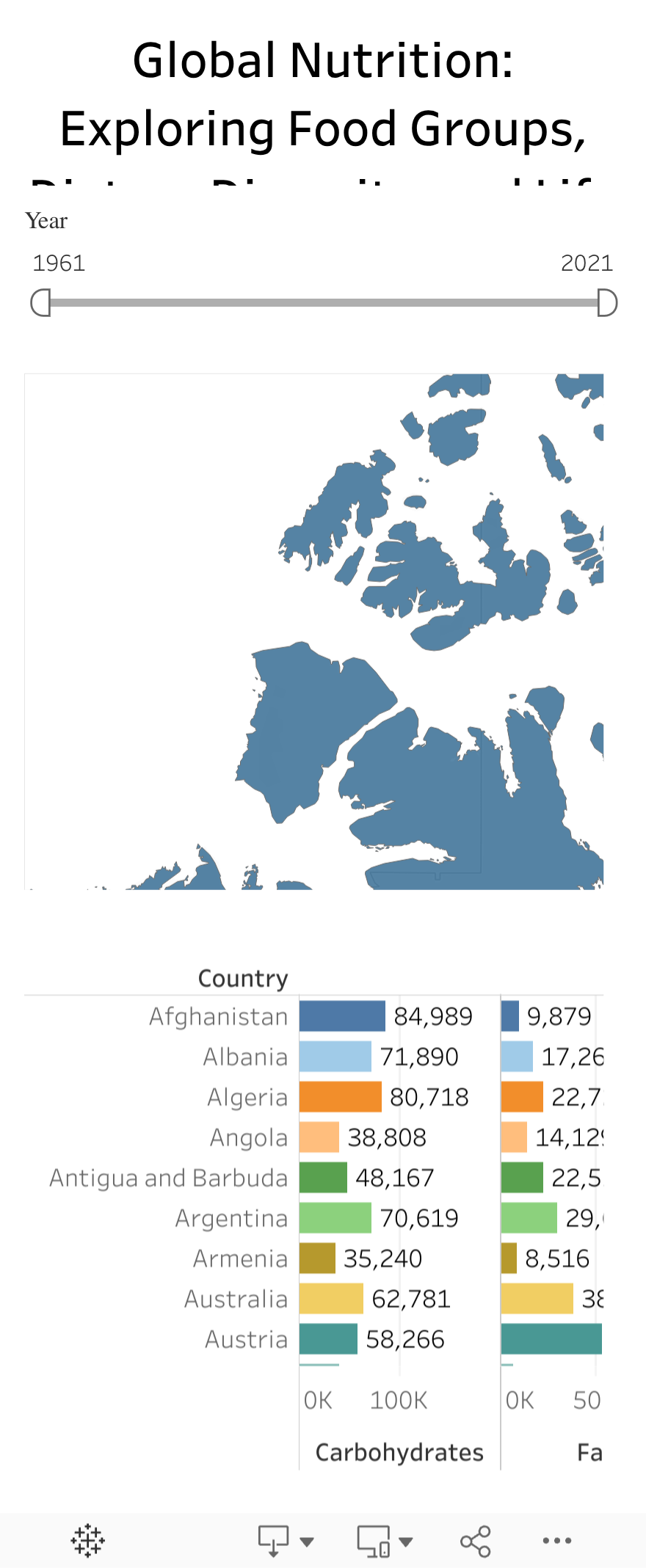
Description: This interactive dashboard examines the nutritional composition and dietary diversity of nations worldwide. A dynamic world map provides a geographic overview of dietary patterns, while synchronized charts break down each country's consumption into three essential macronutrients: carbohydrates, fats, and proteins. Alongside these basic building blocks of nutrition, the visualization includes a unique food diversity score based on Shannon's Index, offering insight into how varied and balanced each nation's diet is. As viewers explore different regions on the map, they can instantly see both the macronutrient balance and dietary diversity of each country.
Why This Matters: Understanding the balance of macronutrients and dietary diversity in different regions provides crucial insights into nutritional well-being beyond simple calorie counts. A diet's diversity score can reveal potential vulnerabilities in food systems and nutrition security—countries with low diversity scores often rely heavily on a limited range of food sources, while those with higher scores typically enjoy more varied and resilient food systems. This information is vital for policymakers and health professionals working to improve nutrition quality and food security. By examining both macronutrient composition and dietary diversity together, we can better understand which populations might benefit from interventions to diversify their food sources or adjust their nutritional balance for better health outcomes.
The Future of Global Nutrition
As we look toward the horizon of global nutrition, we face both unprecedented challenges and remarkable opportunities. Our analysis reveals that while some regions have achieved optimal dietary diversity and nutritional balance, others still struggle with basic food security. Climate change threatens to reshape agricultural patterns, potentially disturbing traditional food systems and affecting nutritional access worldwide. However, technological innovations in agriculture and food science offer promising solutions. Advanced data analytics, like those employed in this study, can help predict nutritional trends and identify areas requiring intervention before they become critical. Moreover, the rising awareness of sustainable eating patterns and their impact on both personal and planetary health suggests a shifting global consciousness about food choices. These insights can guide policymakers in developing adaptive strategies that ensure nutritional security while respecting both environmental limits and cultural food traditions.
Conclusion
Our exploration of global dietary patterns reveals a complex web connecting food choices, nutritional quality, and longevity. Through visualizing sixty years of dietary data, we've uncovered how macronutrient balance and food diversity vary dramatically across regions, directly influencing population health outcomes. The strong correlation between caloric adequacy and life expectancy emphasizes that basic nutrition remains a fundamental challenge in many parts of the world. Yet, our analysis shows that the path to longer, healthier lives involves more than just caloric sufficiency—it requires diverse, balanced diets that provide adequate nutrition while remaining culturally appropriate and sustainable. As we face mounting global challenges, from climate change to urbanization, these insights become increasingly valuable. By understanding these patterns and their implications, we can better shape policies that not only extend life expectancy but also ensure that those added years are lived in good health. The future of global nutrition lies in translating these data-driven insights into actionable strategies that promote both individual and planetary health for generations to come.
Reference
- Food and Agriculture Organization. (2021). Dietary composition by country [Dataset]. FAO Statistics Division (FAOSTAT). Retrieved from http://www.fao.org/faostat/
- Food and Agriculture Organization. (2021). Suite of food security indicators [Data portal]. Retrieved from http://www.fao.org/faostat/en/#data/FS
- World Health Organization. (2021). Healthy life expectancy (HALE) at birth [Dataset]. Global Health Observatory Data Repository. Retrieved from https://www.who.int/data/gho/
- Our World in Data. (2023). Food supply vs. life expectancy [Dataset]. Retrieved from https://ourworldindata.org/food-supply-and-life-expectancy